Christian von Koenigsegg (CvK) wanted to introduce a new instrument cluster for the CCX model on the 2007 Geneva Motorshow. It would feature a more modern and refined look to match rest of vehicle interior and exterior styling. I was tasked to head up the mechanical engineering of the cluster; the Koenigsegg electronics team and supplier would take care of the rest.
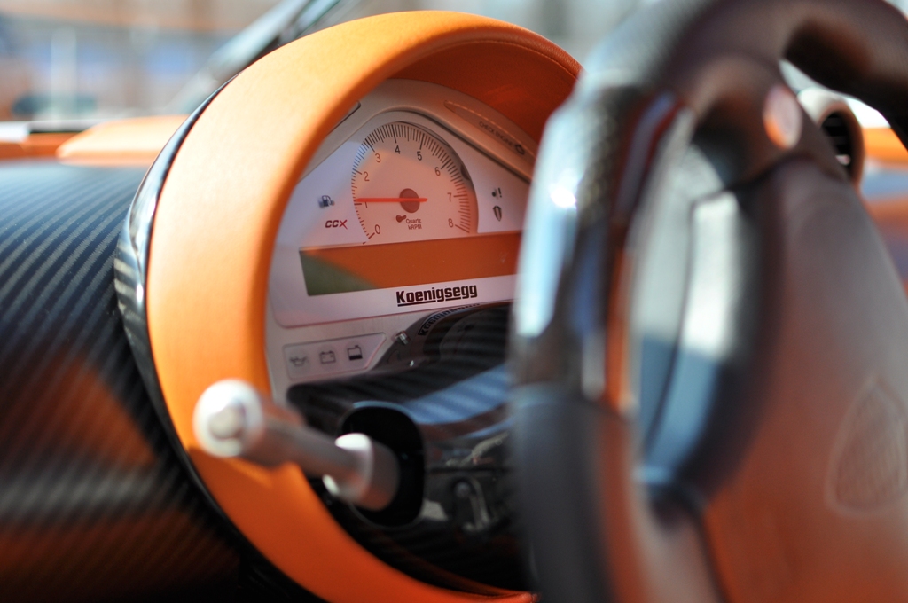
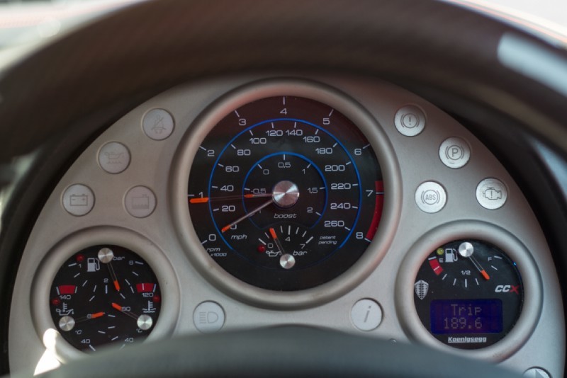
The main design requirement for the concept from Christian was that it had to emulate the functionality of a mechanical Swiss watch (= chronograph; hence the Chronocluster moniker), with three pointers (vehicle speed, engine speed and boost pressure) rotating around a single axis. Furthermore it was requested to look like “something sporty, like a motorbike cluster or so.”
Constraints were that it needed to be backwards compatible with the existing electronic hardware, so that it could also be plug-and-play retrofitted in already delivered CCX and even previous-generation CCR vehicles. All the functionality from the existing panel had to be carried over and some new features needed to be added, so that it would be ready for the CAN transition. It had to be geometrically compatible with the existing structure.
It also needed to be compliant with global regulations, which basically meant EU (and thus UN ECE) and USA (DOT) regulations regarding the use of symbols and their dimensions, colours and light intensity.
To make it a bit more challenging, we wanted to keep it very Swedish: clean and functional styling with basic geometric like shapes without looking simple or clinical. The usability was also an area with room for improvement, while it also should provide a high-end experience. It was going to be the component of the car an owner looks at the most (assuming the owner did not buy a garage queen) and it needed to look the part.
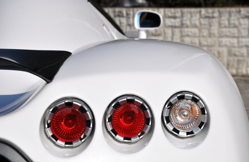
From a rearview of the CCX model, the styling is dominated by three circular tail lamps on either side. When looking at the interior of the CCX, it also featured several circles with an aluminium bezel (e.g. ventilation nozzles).
This inspired me to use three circles as the defining shapes of the cluster. The centre dial would be larger, since it would contain the most important information (from a driver’s perspective).
The initial design proposal looked a bit bland, though it already had some of that ‘sporty motorbike cluster’ feel. The suggestion from the technical director Jon Gunner to use protruding bezels around the main dials proved to be the missing link. When I used a scaled down version of the elliptic curvature from the vent bezels for the protrusion shape, it matched very well with the rest of the interior, while giving the desired look as a component.
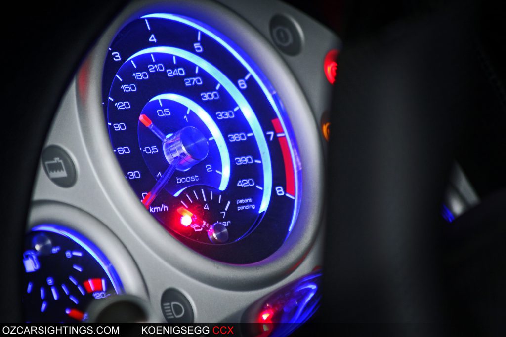
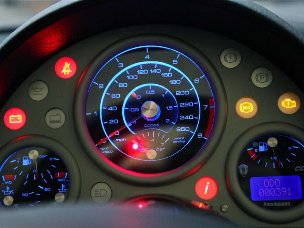
To keep the design clean, a combination of direct and indirect illumination was used. The tell-tales and indicator symbols on the dials were ‘ghosted’ by printing them only once in black, while the rest of the dials was fully printed in colours and black to keep surface clean. The result was that the symbols did not show up, until illuminated. The colour of the warning symbol inserts which were placed outside of the main dials matched the colour of the aluminium frame. The actual colour of the warning symbol when used was generated by LEDs in the by the regulations prescribed colours.
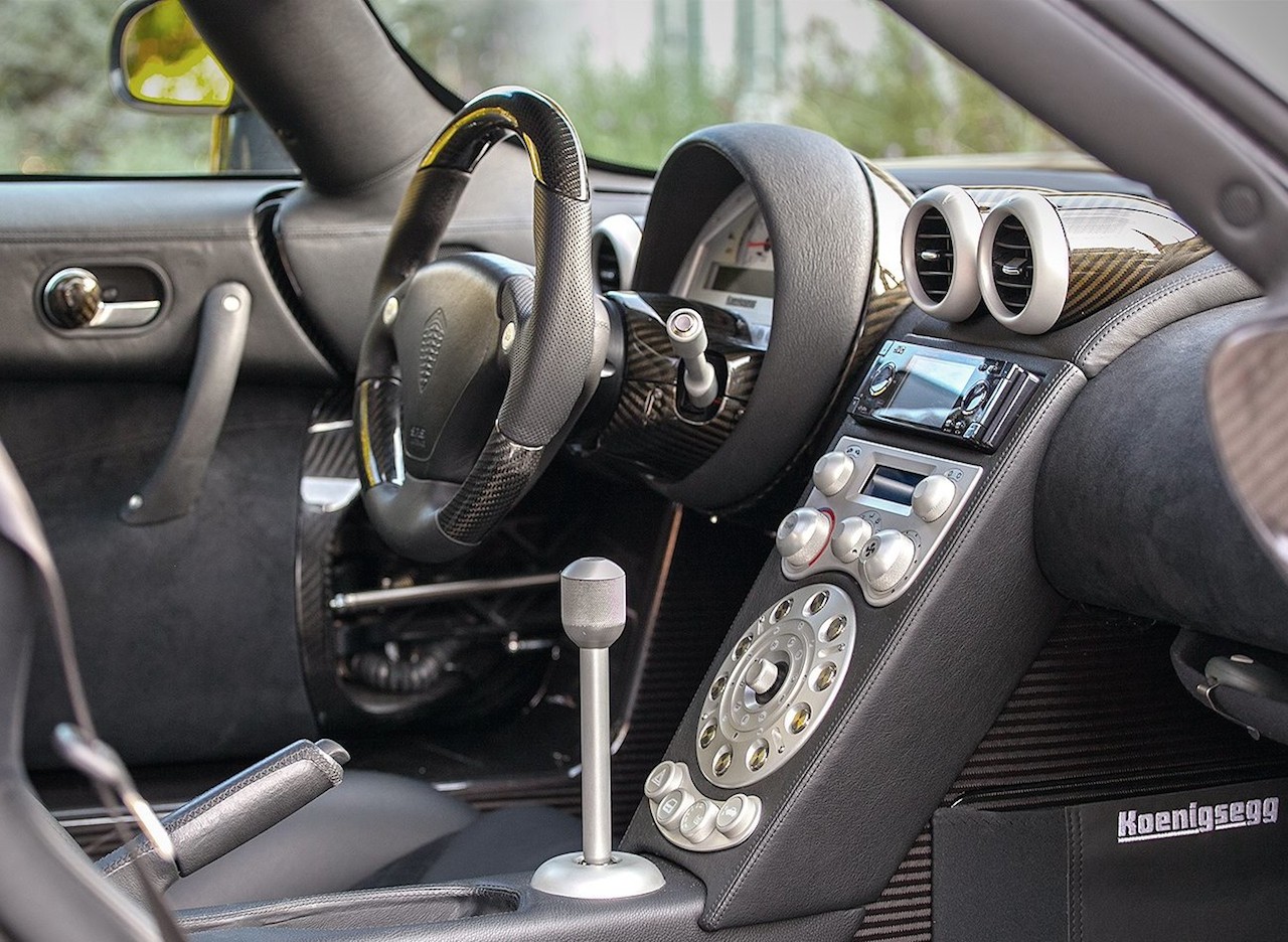
The usability was improved by logically grouping the various symbols and indicators and placing these groups logically on the main and satellite dials and the other surface.
The front of the aluminium frame functioned as the facia, while the rear provided the mounting surface for all functional components.
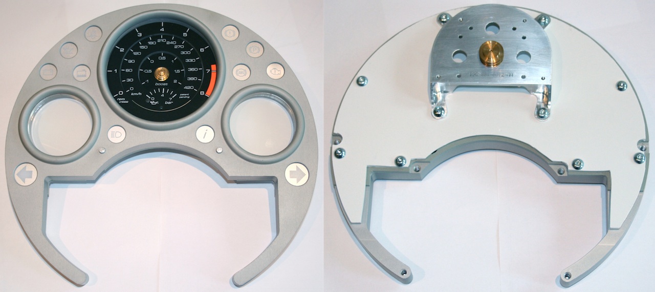
One of the challenges with using both direct and indirect illumination was to diffuse the concentrated LED light to create an even illumination intensity. This was achieved for the dial faces via backside printing in several layers to reduce the transparency. For the indirect lighting this was achieved via a ‘frosted’ effect on the inner edges of the illuminating ring around the front face of the dials. The other surfaces were kept polished to achieve a good illumination strength.
The matte black coating on the dials provides a better contrast than regular printed items; the pointer tips were painted with with day-glow paint, while redline indicators were kept as bright as possible in the printing process.
All electric input signals were reverse engineered with Koenigsegg electro engineers. This information served as input for e-hardware and software developers (external companies).
The actual graphical design of the dials was done again with feedback from Christian, the technical director, as well as with the Norwegian partner design agency.
Some side-effects of the development of this instrument cluster were the selection of a font-face (Eurostil derived), which since has been used for all interior design and publications (e.g. brochures, websites, IVI, HMI), LED colour matching of all interior lighting, as well as a harmonisation of the anodising colour (which depends on the aluminium alloy specification and even production batch) and surface finish (roughness and curvature continuation) of all machined aluminium components.
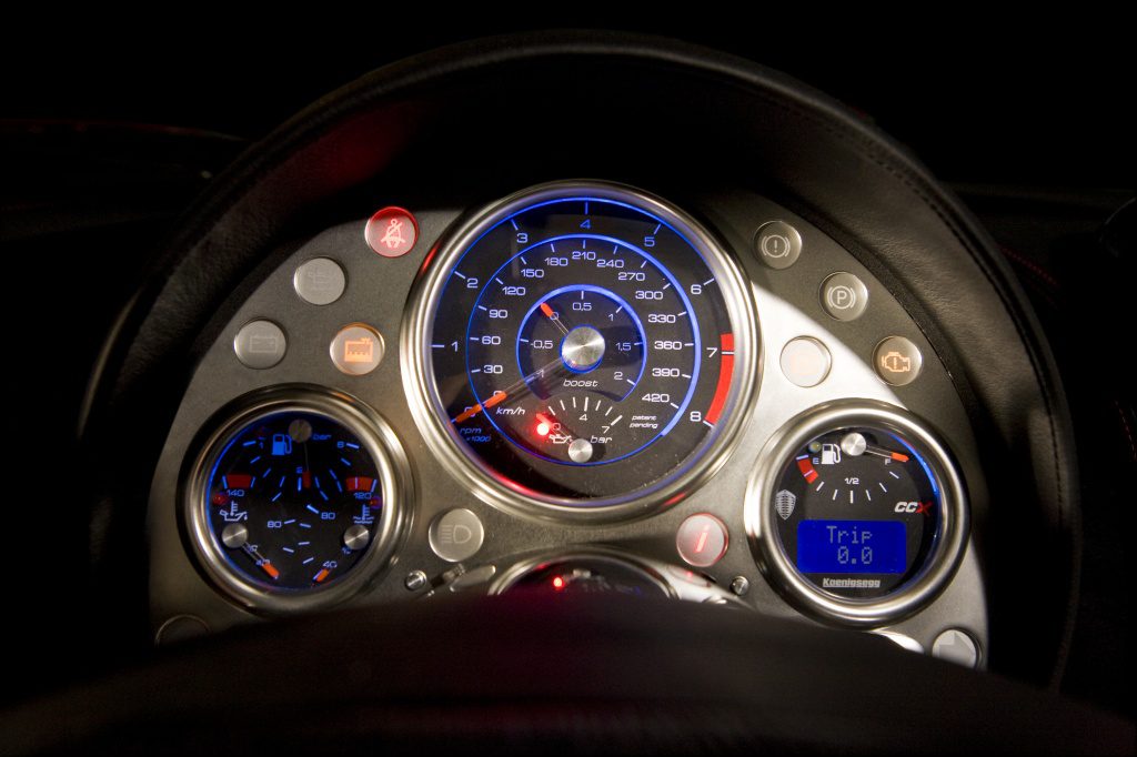
The fact that about a dozen of clients decided to retro-fit their vehicle with this cluster, as well as it becoming the standard item until the Agera model was introduced (about 30 cars), proved that the design goals had been achieved.
